Hostile (Graphic) Design
How my stupid smart TV made me think of evil park benches.
A few days ago, I was sitting down to watch some TV. I don't remember what time of day it was - maybe it was a calm Sunday morning, where I was about to indulge in a relaxing cartoon or watch a YouTube video of someone attaching a vibrator motor to a baby monitor - maybe I had just finished cooking dinner and my partner and I were about to sit down to continue our ill-advised rewatch of Lost. Whenever it was, my mind was in a place of calm and autopilot. I just turned on the TV, my hands a step ahead of my mind, and tried to navigate to a familiar icon on the screen.
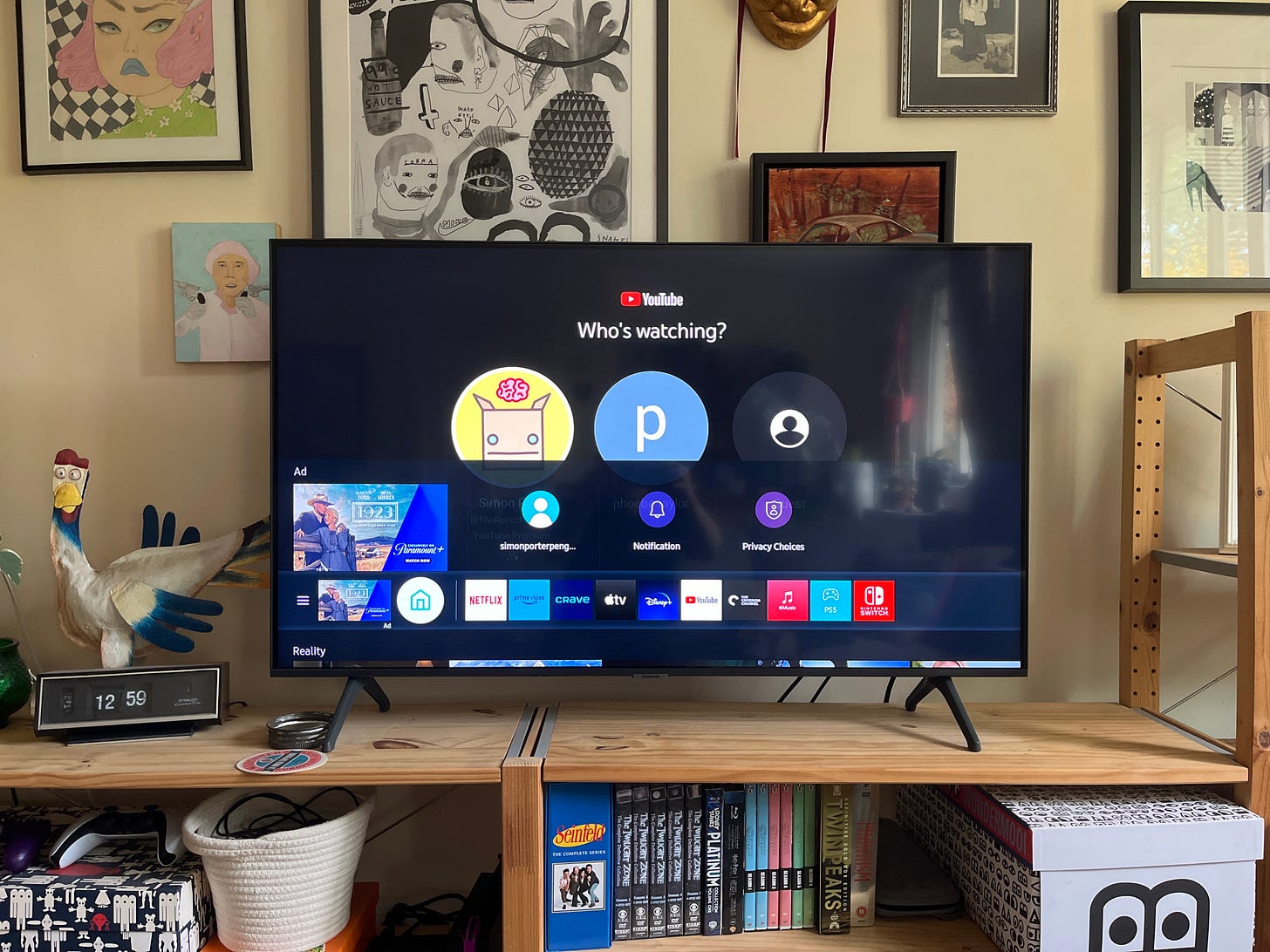
But something was wrong. The familiar setup I was used to had been changed. I was shocked out of my sense of automatic ease and forced to decode what I was looking at. Apparently, my Samsung TV had recently updated itself and the only noticeable change was the addition of an ugly sliver of a menu under the main navigation bar. I was disturbed. I was enraged.

I can't accurately describe how annoying this is to me - though I'll try my best to explain. Not only is this design change kind of off-putting because its unfamiliar, it just looks bad. It takes a piece of interface that was designed to be anchored to the bottom of the screen and floats it up unnaturally. Now, underneath it, we see a tiny splinter of a different interface - one label for a section of thumbnails that we can see an even smaller bit of the top of but can't actually see any information about.
Look at how stupid it looks. It looks very stupid. The worst part is that it's teasing me - forcing me to notice this thing by changing a core part of the interface and luring me in with the obscured content while refusing to tell me anything useful about it. The technique of peeking the edge of something into a design is a classic way of implying that there is more to be seen, and here it's being used to pull me away from a core part of using my TV.
All of this is done to “hint” that there’s a new feature Samsung wants me to use to watch things that I’m sure they’re paid to promote, or that they can gather some data from at the very least. It's not something I asked for, it's not relevant, and it’s invading my TV's usual functionality.
Okay, sure, it’s stupid. But why am I writing about this? Couldn't this have just been one grumpy and much more concise tweet?
The thing that’s special about this minor update that interrupted my TV viewing routine is that it made me think of something else, something a bit darker. Something that I believe this design update is related to: it made me think of hostile design.

Hostile design, as I first learned about it, is the practice of deliberately designing objects and spaces to be aggressive and unwelcoming to people. Think of a park bench designed to make it uncomfortable or impossible to sleep on. At first glance, it might not seem like a "hostile" object, but at the core of its design, it's saying some people's use of this object or space is so bad and unwelcome that they deserve either discomfort or complete isolation from this space. It's the same idea as having spikes on buildings to prevent pigeons from roosting there, except... you, know... the pigeons aren't pigeons. They're humans.
Evil + Creativity = What the fuck is wrong with people?
So what happens when that same methodology of thinking - of making something deliberately worse for some people in order to reinforce the standards of another - is applied, not to the design of a bench or a public space, but instead to graphic design and user-experiences?
We can see a clear - if a bit more less violent - parallel of this in my stupid smart TV's menu update. Another obvious version of this kind of hostile graphic design is seen right in the same picture: advertising. In this case, a large portion of my TV's user-interface is being taken up by two ads for the same thing that I don't care about. This isn't designed to make my use of the interface easier, simpler or more intuitive. The entire thing is deliberately designed in a way to do something that makes my experience worse.

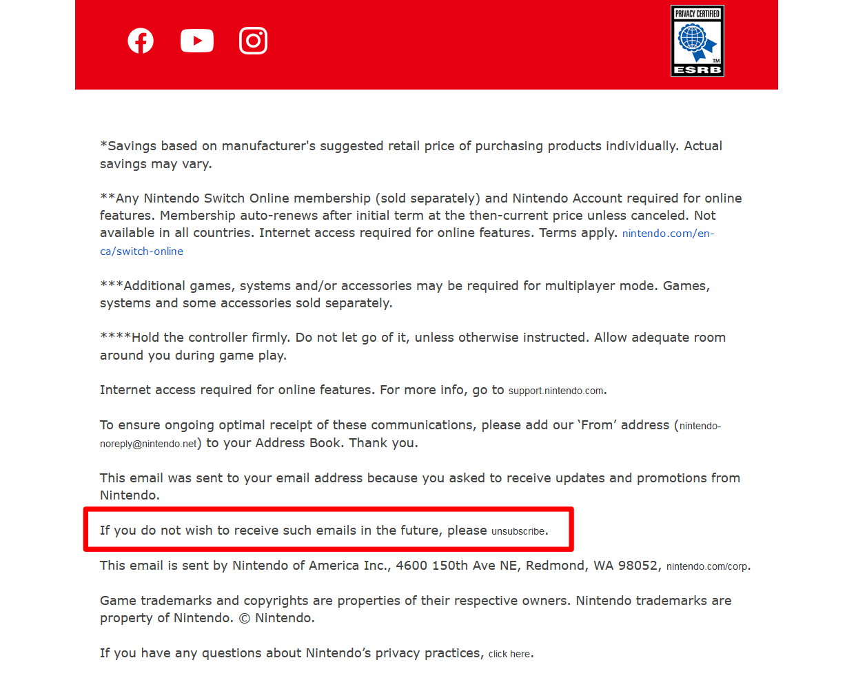
Another simple version of hostile graphic design that you're probably familiar with is the phenomena of tiny, low-contrast "unsubscribe" links in marketing emails. These leverage the inverse of design principles for good, clear hierarchy to make it harder for you to find a link you might be looking for. Reducing contrast, scale, adding visual noise by burying the link in a wall of other text and using unclear language to make it harder to spot at a glace - all of these are active decisions made to make the link harder to find.
Why, if you want to unsubscribe, do they try to then make that harder for you? Simple: because they don't care about what you want - they care about what they want. So they use design to make things harder for you.
Another example of this can be seen at the bottom of my own newsletter. Since I use Substack to share this writing, I don’t have control over the design of the email footer. So, even if I wanted to give you a giant unsubscribe button, I can’t. Substack’s hostile design is core to the platform’s growth strategy - they can’t risk me or other writers compromising that. I even tried adding a simple unsubscribe button right here, but I can’t. The simplest thing I can do is direct you to this equally complicated help article. The friction is so high - and that’s by design.
The author and prominent internet-thinky-person Cory Doctorow has coined this wonderful and troublingly-useful word: enshittification. Enshittification as Doctorow uses it is a term that describes the way that a product or service will undergo a prolonged degradation that leverages the value or utility people placed in it to try to become profitable or to meet some other goal. The main point is that, as the name describes, the process involves making the product or service shittier for the user in order to meet those goals. It’s a fascinatingly relevant concept in our day-to-day lives. I think hostile design, in a way, is another example of this process.
Hostile Design is the enshittification of design. Or, at the very least, it’s design leveraged to facilitate the enshittification of something else.
Hostile graphic design is everywhere, especially in digital spaces. You see it in apps like Facebook, Instagram and YouTube, when a familiar button you use is suddenly moved or replaced with something you don't expect, don't care about and don't benefit from. They've manipulated both your muscle memory and their design methodology to force you to interact with something they want you to interact with - not something you wanted to interact with.
I’m actually very curious if other examples of this come to mind for you. Let me know in the comments of this post.
There's a distinction to be made here, though. Hostile design isn't the same thing as simply bad design. Under-considered and lazy design is everywhere, and often it creates a worse experience for the people seeing or interacting with it. But that's not necessarily an active decision on the part of the designer. Design that offends your taste isn't the same thing as design that is trying to make your life more difficult. The distinction is kind of gross when you think about it.
Hostile design is actually good design. It's successfully achieving its goal of being shitty.
That active, intentional piece is the truly upsetting part about hostile graphic design (and hostile design, in general). In most cases, it represents a pretty competent application of design thinking and execution. It's taking all the right lessons about design and applying them to do harm.
These harms exist on a spectrum, obviously. I'd argue the hostile design we started with of trying to do anything you can to keep someone from sleeping on a bench or finding shelter under a structure is some of the highest-order evil in this space. But the active participation in creating a less pleasant, regressive, enshittified design - and doing that well - is still a questionable thing to do even if it's just through updating a TV's user interface.
With great power, comes great responsibility.
In a world where we hear a lot of talk about accessibility in design, I think there's a tendency to vilify the lack of action or consideration that makes things inaccessible or unpleasant for people. There's real value in the way visual arts like graphic design, filmmaking or any other visual storytelling can connect with more people by simply considering how we might make it more accessible to them. It makes our work more powerful when it is easier for more people to access.
While it’s important to call people in by pointing out ways we can all make our work more accessible, I think there's as much of a need - and a responsibility - to call people out for these deliberate and, at their worst, harmful uses of design and creativity. If you learn about the power of a well-crafted message or a considered design, and you choose to use those techniques to make people's lives worse, that's just a really fucked up decision.
Let me be clear: I'm not saying you should go to jail for being a competent designer who makes hostile or even just annoying work. I get that a lot of these designs are likely implemented by people who are just trying to make a living, and don’t have a say in the goals or strategies they’re asked to implement. There's also definitely a place for challenging art and design that forces us to consider something in the process of decoding it - that's a valid use of a medium that I don't feel like needs policing.
Maybe instead, we should all feel more responsibility to add more goodness into the world through the work that we do. Maybe those of us who do the opposite should start to see that as more than just a harmless way of achieving some kind of goal.
You should have empathy as an artist and a designer, and you should see that as a responsibility in the work that you do. Our creativity is special. We shouldn’t use it to make people’s lives worse - even if that means we make a bit less money or have to confront uncomfortable truths about ourselves. In the end, I think a world that’s easier to navigate because design made it better for us is a goal we should all embrace.
That’s all for now. Have a nice day! Make something nice. 😊
Lots of love,
Simon 🙈❤️
P.S.
Links & Things
The guy I linked to at the top who made the vibrating baby-monitor also made the first project that I’ve seen use ChatGPT in a way that was actually useful and added value to the project.
I’m generally super skeptical of all things “A.I.” right now, but this kind of “data formalization” work seems like one actually useful way LLMs could be used. It’s also probably the least marketable or exciting way to use them, so I doubt we’ll see that become the big pillar of machine learning technology over just… writing your doctoral thesis for you or some shit.
I’m a big fan of David Farrier and his Webworm newsletter. I was really excited to get to see his latest movie, Mr. Organ, screened in Toronto a few weeks ago. The score for the movie was great, and this behind-the-scenes look at how they made the music for the movie is really amazing. You’ve gotta appreciate when people invent instruments and give them incredible names like The Clamp.
The game designer behind little indie games like Super Smash Brothers, Masahiro Sakurai, has been doing some really amazing videos on game design. This one on making design decisions as a team applies to basically any creative work and is extremely thoughtful and powerful. It ties into how I’ve been thinking recently about how “safe” ideas area actually the biggest risks you can take, creatively.


